AdvocateBot is a virtual assistant designed to empower advocates by enabling efficient care provider searches, real-time member query resolution, member information updates, and more. By leveraging advanced AI/ML capabilities, AdvocateBot has transformed member services, streamlining operations and enhancing user satisfaction.
Discover how Florida Blue leveraged AI/ML with Kore.ai to revolutionize their member experience.
The Advocatebot Find Care flow aimed to enhance the advocate experience by simplifying the search for healthcare providers.
My role
As the UX designer, I led the experience from ideation to delivery.
Team:
Project managers (2)
Project owner
Copywriter
Visual designers
Development team
Deliverables:
Wireframes (created by me)
Prototypes (created by me)
Usability Testing Plans and Reports (led by me; shared findings with PMs and dev team)
Final design specs and handoffs (I documented logic and flows; visual designer finalized the UI)
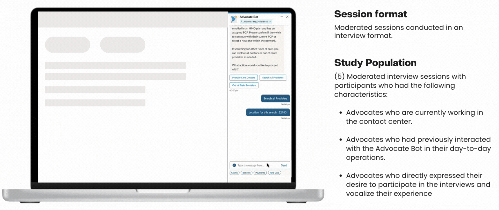
Advocate Interviews (led by me, with support from a UX researcher)
Devices and segments
Desktop Segment: Internal use (Advocates)
Tools
Figma FigJam
Duration
3 Weeks
Setting the Stage
At Florida Blue (Blue Cross Blue Shield of Florida), advocates are often the first point of contact when members need support. Whether someone is trying to find a doctor, change their primary care provider, or make sense of a claim, advocates step in to help.
This project aimed to improve their daily workflow by enhancing Connect—the primary tool they use to assist members. Because advocates manage a wide range of tasks in a fast-paced environment, streamlining their experience meant better outcomes for both them and the members they serve.
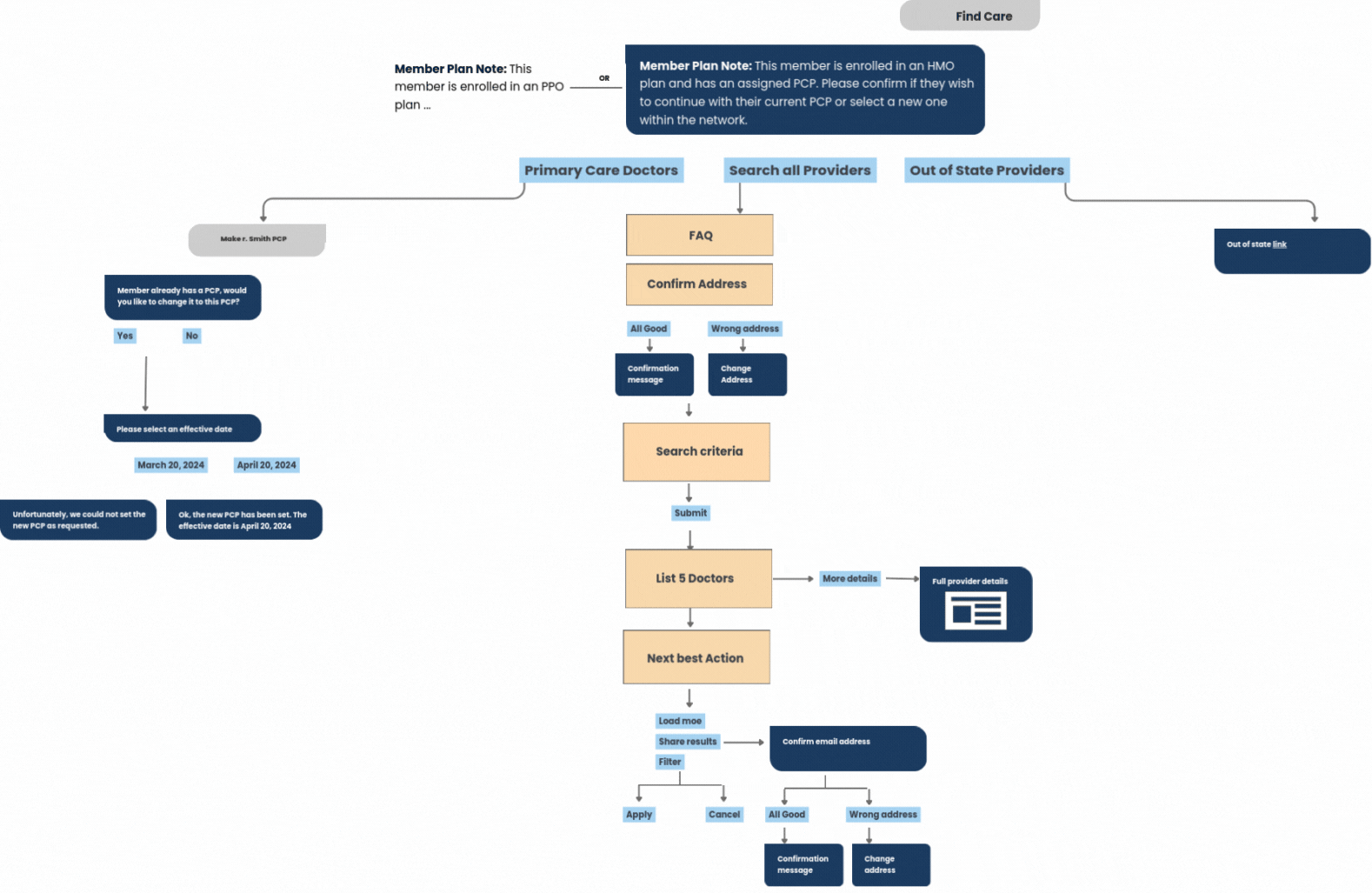
Why Find Care?
Find Care is one of the most-used tools for advocates. It helps them assist members in finding doctors, clinics, pharmacies, and more.
My task was to design a smoother Find Care experience inside the chatbot so advocates could quickly and confidently help members find the right provider.
In our kickoff meeting, the project manager highlighted three main goals:
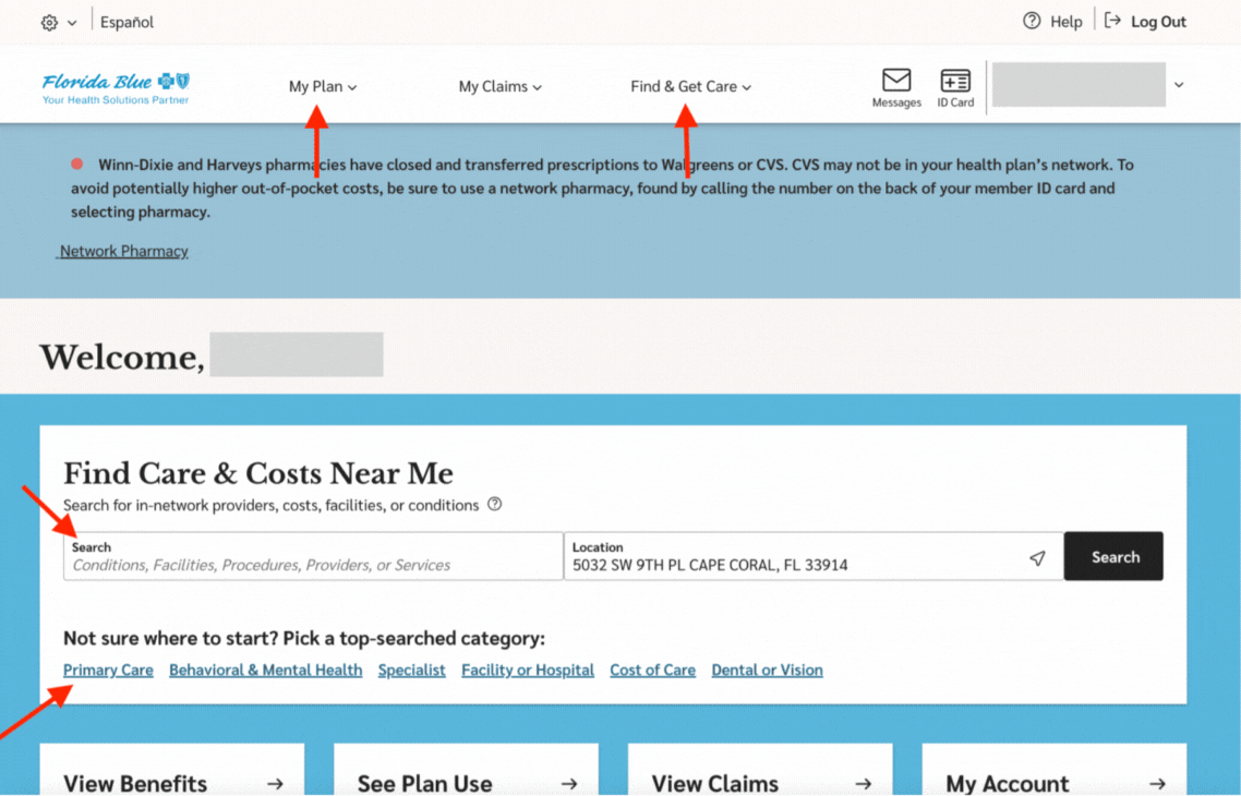
Let advocates switch a member’s PCP.
Help members search for in-network providers.
Support out-of-state provider searches.
Understanding the Problem
Pretty early on, I noticed that both members and advocates were facing similar problems—even though they were using different tools. Issues like outdated results or unclear provider categories affected everyone.
So I decided not to treat it as two separate problems, but to look for solutions that could improve the experience for both advocates and members.
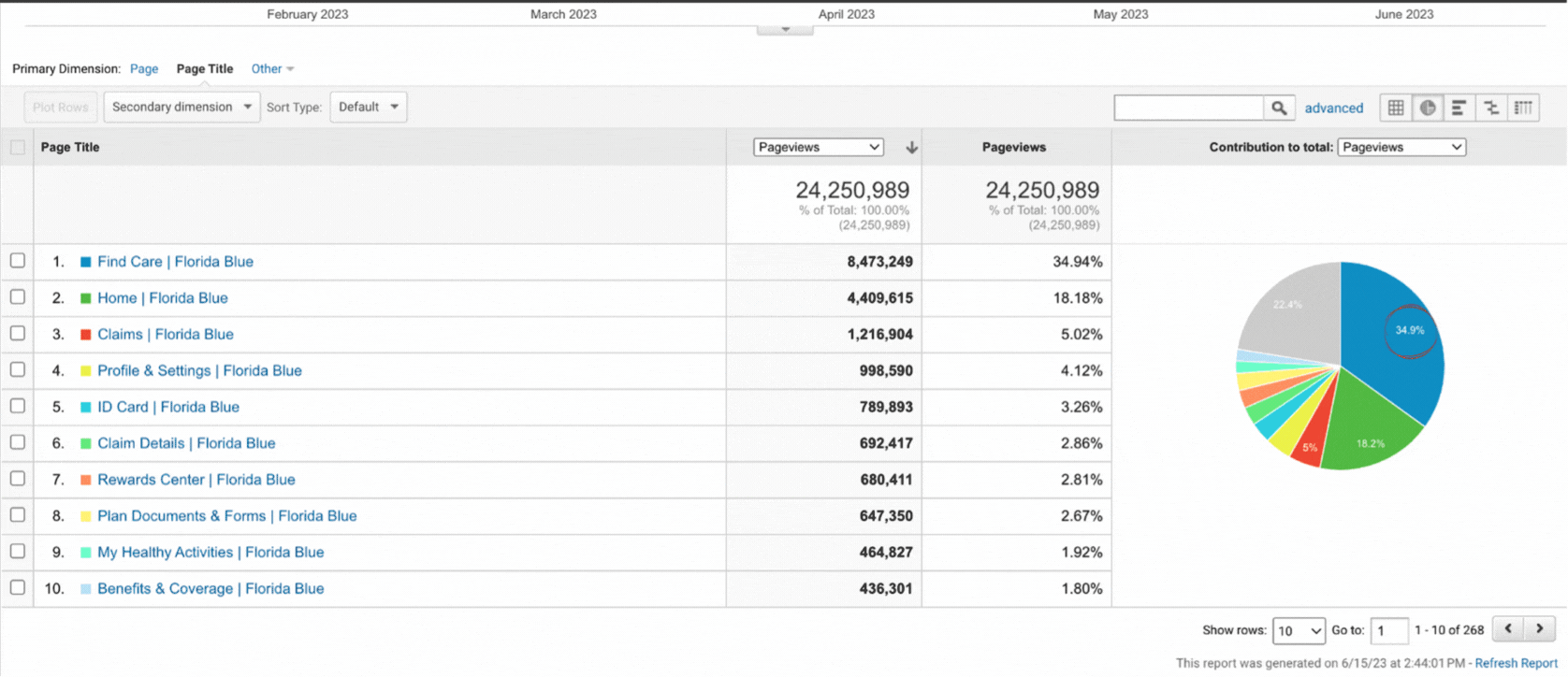
To better understand the problem, I reached out to the CX analytics team to see if they had any data or feedback related to the Find Care feature. They shared a report—and it turned out that Find Care is actually the most visited page on the entire site. That insight really reinforced how critical it was to get this experience right.
📌 During those early conversations, we also identified the need to define more meaningful KPIs to measure success.
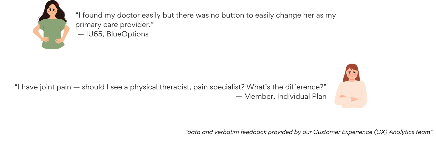
The CX team provided direct member feedback as well. One person shared, “I found my doctor easily, but there was no button to make her my primary care provider.” Another asked, “I have joint pain—should I see a physical therapist or a pain specialist?”
Key Pain Points
I started with the member experience and then compared it with the advocate workflow.
1. Too many starting points: There were multiple ways to start a search, each leading to different results.
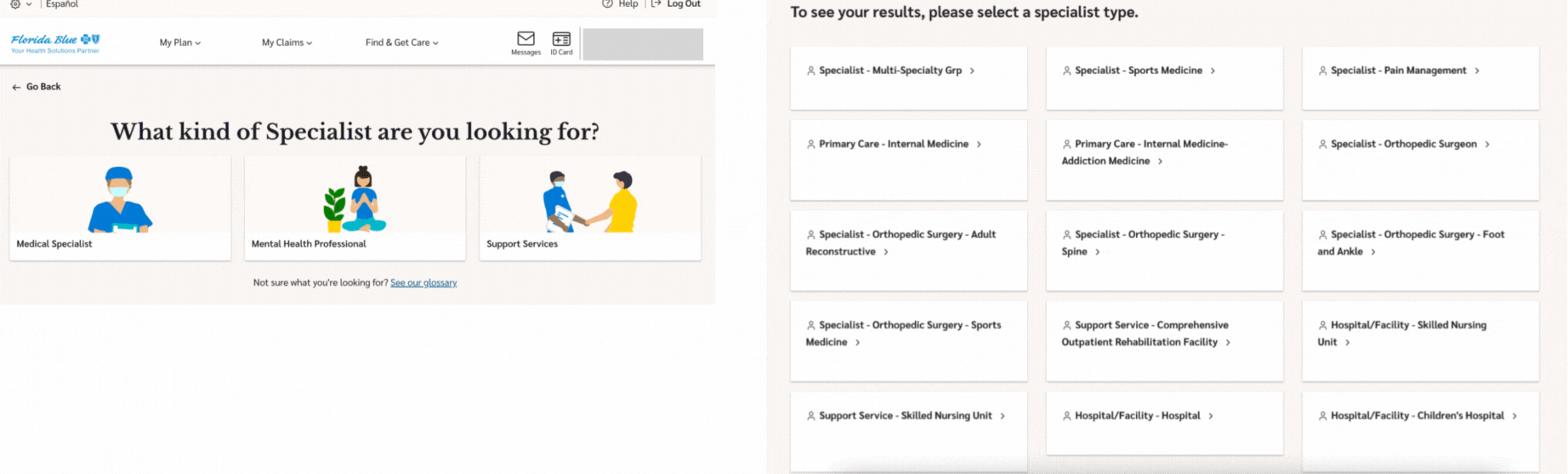
2. Overwhelming categories: The mid-flow category screen often showed either too many or just one irrelevant option—confusing users.
3. Unintuitive dropdowns: The dropdown menus were deeply nested and hard to use.
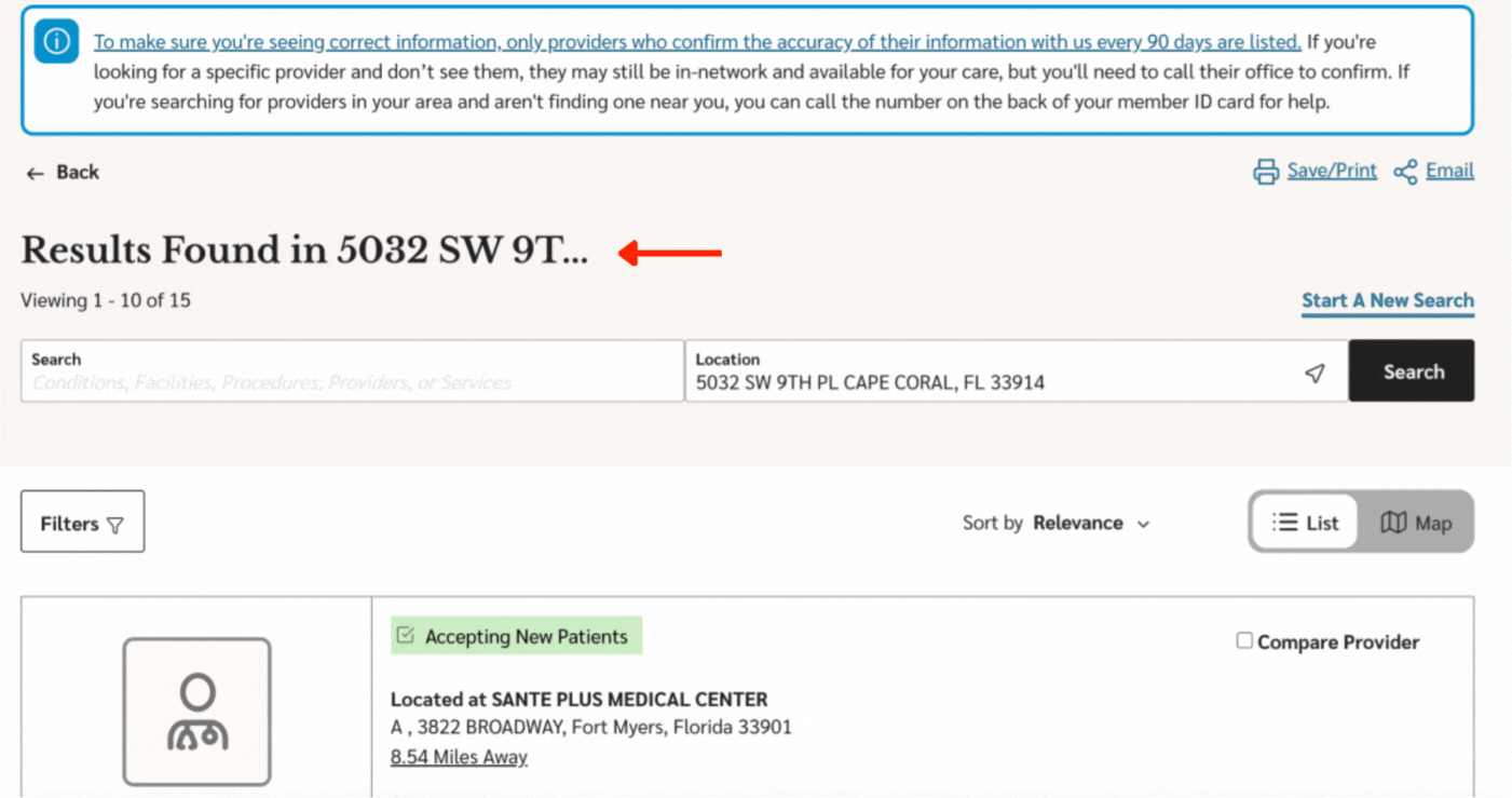
4.Lack of confirmation: Once on the provider list, there was no feedback on what had actually been searched.
📌 I also did live observations. I reached out to an advocate named Ari and asked her to walk me through a few tasks while I observed. Seeing the flow in real time revealed exactly where things slowed down or got confusing.
Competitive Analysis
In addition, I audited platforms like Oscar, Kaiser, and UnitedHealthcare to understand best practices.
Oscar ✅ Clean and easy-to-use search experience using tabs. ❌ Accessibility issue – Tabs aren’t screen reader–friendly, and it’s unclear which one is selected or how to navigate between them.
Kaiser ✅ Clear display of providers and conditions. ❌ Too many clicks – It takes extra steps to actually reach the needed information.
UnitedHealthcare ✅ Straightforward organization into four main categories. ❌ No free text input – Users must click through each step, making the process slower and less flexible.
Mapping the Journey
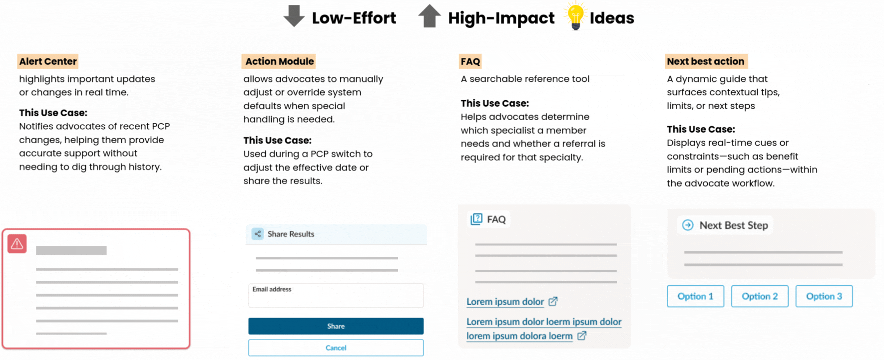
I mapped out every step advocates take—from picking up the phone to resolving a case. Journey mapping helped surface high-impact, low-effort changes.
And since this wasn’t just a chatbot, I used conversation where it made sense—but for tasks that didn’t require back-and-forth, I introduced Reusable UI components instead.
Collaboration and Content
Because we serve members with different plan types (HMOs, PPOs, etc.), content had to be accurate and inclusive. I worked with Andrea, our content strategist, to write clear, helpful, and tone-appropriate copy.
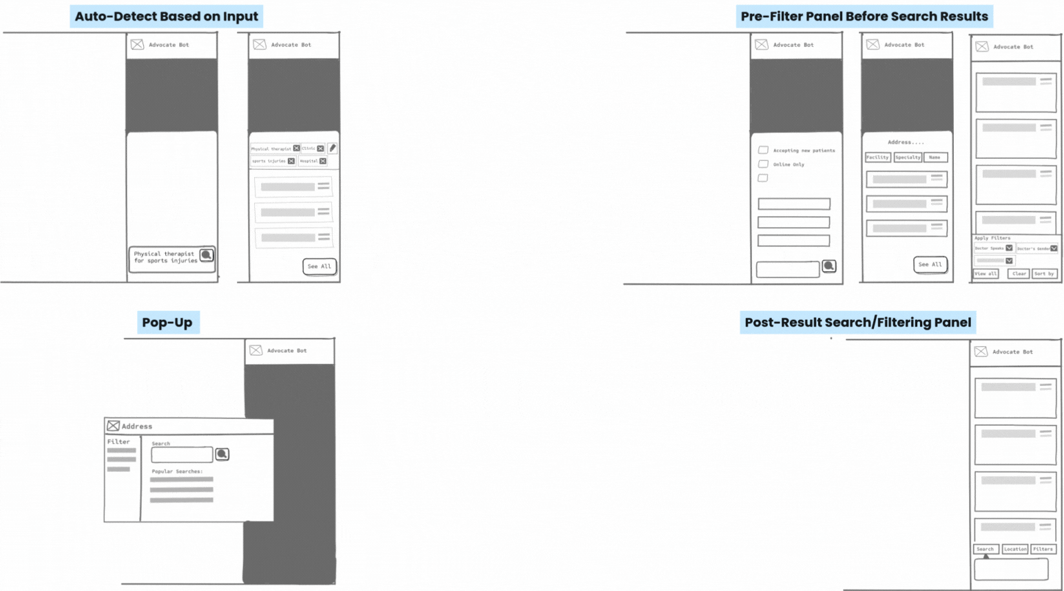
Exploring Layout Possibilities
I explored different ways to present search and filters—like side panels, pop-ups, and smart defaults based on user input. These early concepts helped guide conversations with PMs and devs about what was feasible and what would offer the best user experience.
Designing for Technical Constraints
We used Kore.ai for some chatbot functionality (like summarizing calls or answering FAQs), but provider search had to be handled through internal tools.
That meant:
Kore.ai couldn’t support open-ended search.
Our tool couldn’t interpret phrases like “I need someone who speaks Spanish and is available after 6.”
I had to use structured inputs like buttons and dropdowns.
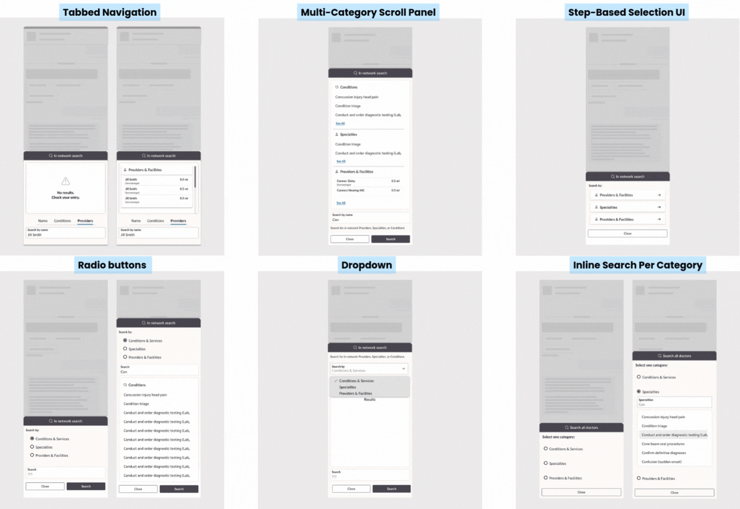
UI Pattern Exploration
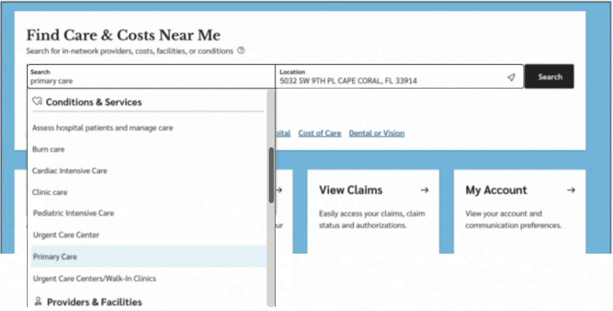
I explored different UI patterns for the search experience and chose a bottom drawer sheet—it kept the conversation flow intact without taking users out of context. Based on feedback from advocates and PMs, I narrowed the search entry points to three key categories: conditions, symptoms, and provider or facility name—the most common ways users start their search.
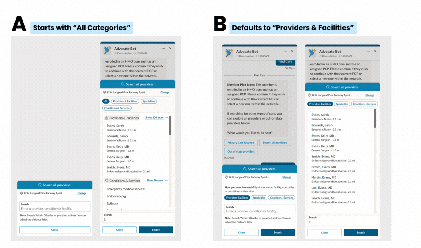
Final Design Decision
I tested two design variations with five participants.
Version A included an “All” option showing top results first, followed by a “See more” link for full categories.
The second version defaulted to a specific category: provider or facility name.
Most users found the second version easier to use—it felt more focused and reduced decision fatigue. Since our data showed that most calls were about specific providers, I moved forward with that design and defaulted the search to provider or facility name
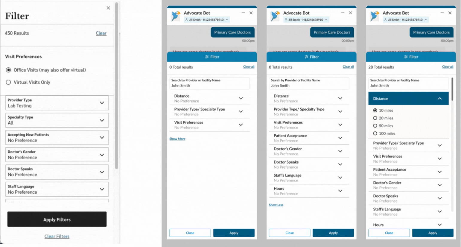
Filter Optimization Due to budget constraints, we couldn’t modify how the filter logic functioned. After confirming technical limitations with the dev team, I focused on UI improvements instead.
I reorganized the layout—prioritizing the most-used filters at the top and grouping less common ones under a “See more” section. This made the interface feel cleaner, more intuitive, and easier to scan—without changing the underlying functionality.
Testing with Advocates
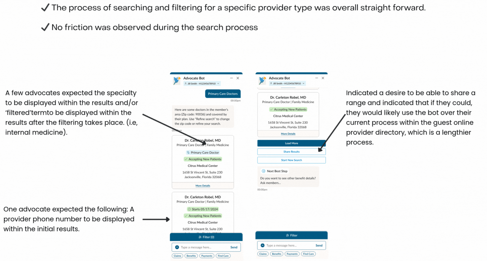
Key Findings from Usability Testing
Iterating on Design Based on Feedback
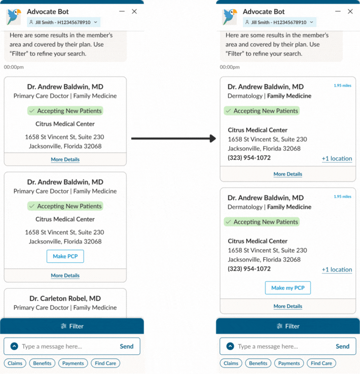
After testing, I refined the provider cards to make key details—like specialties and contact info—more visible and easier to scan. These updates were directly informed by advocate feedback and aimed at improving usability.
However, due to limited engineering bandwidth, we had to postpone the redesign of the ‘Share Results’ feature. We kept the existing version for now but documented the improvements for a future release.
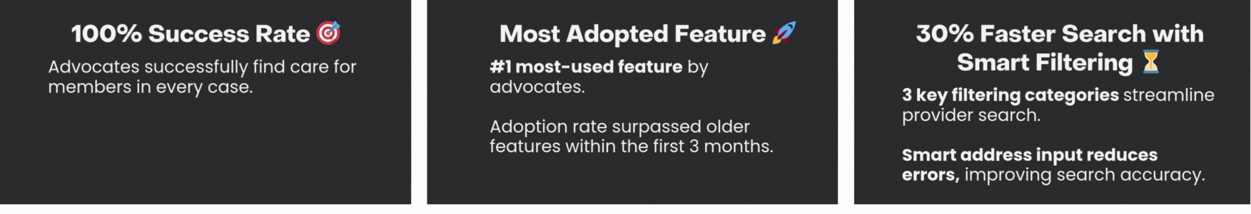
Impacts:
Key Learnings:
Designed with a conversational mindset—prioritizing clarity, tone, and user guidance, especially during search and address input moments.
Collaborated closely with engineering to align on feasible solutions and minimize unnecessary complexity.
Developed reusable patterns like the Action Module and smart entry prompts that can scale across various chatbot experiences.
Navigated cross-functional misalignment by clearly communicating user needs and the rationale behind design decisions.
Proactively connected with teams managing the member-facing experience to share insights and align on a consistent approach—strengthening collaboration and driving broader organizational value.
Remained adaptable, helping the team pivot quickly when priorities or scope changed.
Established clear KPIs early to drive prioritization and measure the impact of our design decisions
")